Tuesday, June 3, 2014

The Most Common Mistake When Checking Colors

I haven't blogged in the last week because I've been so busy with one of my workshops. It went really well! These will look even better once they're varnished, but here are two of the student paintings from the class:

Sue Gutierrez's painting from the Draw Mix Paint Portrait Workshop
by Sue Gutierrez                click to enlarge

Susan Sims's painting from the Draw Mix Paint Portrait Workshop
by Susan Sims                click to enlarge

There are certain problems people run into in every workshop I teach, including this Portrait Workshop where I saw it happening over and over again. This is probably the most common mistake when checking colors and painting them in.

Let's say you are checking the colors of an eye in the image below.


Let's zoom in and look at the "white" on the left side of this eye:


Typically, people will check the color of the white of the eye by putting a little spot of paint in the middle of the area, where the black dot is in the image below.


Then they turn to their canvas and paint in the entire area like I have illustrated here:


As you can see, the white of the eye was not a uniform single color as one might assume. Instead, it gets much darker toward the edges, and lighter toward the bottom right.

It is much better to check the color on the edge of the area, which I've indicated here with black dots:


Then paint the whole area with this darker color, and only paint a small spot of the lightest color in at the end right on top of the darker color, as I've illustrated below.


This is just one example, but it's easy to make this mistake anywhere. When checking your colors, find the spot where the color matches, then ask yourself "how high up does it go? how far down does it go? how far to the left does it go?  how far to the right does it go?" This is the only way to know for sure exactly what color goes where.

So do not make assumptions about color and value. Let the color checker teach you.

— Mark Carder
my free videos: drawmixpaint.com

Have questions or comments? Click here to discuss this post.

Thursday, May 22, 2014

Why I Never Use Matte Varnish

I just finished this video. In it I demonstrate why I much prefer varnishing my finished paintings with gloss varnish rather than matte varnish:


— Mark Carder
my free videos: drawmixpaint.com

Have questions or comments? Click here to discuss this post.

Monday, May 19, 2014

Andrew Wyeth and the Importance of Personal Perspective

Bo Bartlett, a close friend and student of Andrew Wyeth, commented on his teacher's view of some of the negative criticism he received:
People only make you swerve. I won’t show anybody anything I’m working on. If they hate it, it’s a bad thing, and if they like it, it’s a bad thing. An artist has to be ingrown to be any good.
I couldn't agree with him more! In the end every artist will stand or fall on their own taste and perspective.

Andrew Wyeth has had a special influence on me. When I was very young my father had prints of Wyeth's work hanging throughout our home. They seemed almost magical, they spoke of something very deep and serious. I can still remember looking at them at length, completely moved by his work even as a young boy.

"Wind from the Sea" by Andrew Wyeth
"Wind from the Sea"                click to enlarge

What makes his work stand out to me personally is not the exact realism that he is capable of — there are many artists capable of that. It is something else, the treatment of subject, the honesty, the truth, the humbleness in Wyeth's voice.

The other night I watched this documentary, Michael Palin in Wyeth’s World:


Palin talks about how Wyeth waited two months for the wind to change so that he could capture it in “Wind from the Sea”. It is this patience and regard for his subject that really comes through in his work. It was very inspiring to see how Wyeth worked with his subjects and how important that was to his compositions.

— Mark Carder
my free videos: drawmixpaint.com

Have questions or comments? Click here to discuss this post.

Friday, May 16, 2014

Using Oil Instead of Retouch Varnish

As oil paint dries on canvas, it will become matte and "flat", making it difficult to continue painting with fresh paint. This is normal and all quality oil paints will go through this change. The darks especially will become sunken in, and the blacks will become gray as you can see in the image below.


It is quite common for artists to use retouch varnish to "bring back" the matte areas before painting further, but I do not recommend using any type of varnish until your painting is completely finished. Varnish between layers of paint can lead to many problems down the road as the oil paint continues to dry over the years.

So instead of retouch varnish, you can use a bit of refined linseed oil, which is very easy. I just posted a new video demonstrating how to do this: oiling out paint that's drying

— Mark Carder
my free videos: drawmixpaint.com

Have questions or comments? Click here to discuss this post.

Tuesday, May 13, 2014

Drawing Simplified:
Points, Angles and Curves

Achieving an accurate line drawing before you start to paint is very straightforward and requires no natural ability. There is no need to bring a lot complexity into it. By using a proportional divider to take measurements directly from your subject, anyone can draw well.


The reason I recommend using a proportional divider is that over time, it will to teach you to draw freehand. It will force you to see the world in simple proportion as an artist should. I have seen many of my students learn to draw after using a proportional divider for only a few paintings. Even those students who claimed they could not draw a "stick figure" beforehand.

What the proportional divider does is reduce a complicated three dimensional subject into simple points and angles, which I will demonstrate here with this still life I painted:

click to enlarge

In the image below I have plotted all the major points. I also drew a vertical line down the middle of all the symmetrical objects as well as a box around the elephant. There is nothing difficult about any of this, it is simple measuring and plotting of points directly from your subject (either from a photo or from life).


Next I have plotted my angles, also by using the proportional divider.  These are just short straight lines that indicate the line's angle as it intersects a given point. I have also drawn in all the obvious straight lines.


This is very helpful, as you can see in the image below. Notice how we can begin to see the shapes of the objects even with only a few points and angles drawn in.


The last thing to do is to draw in all the easy curves. These are all the curved lines we can draw by using the points and angles as a guide.


All that is left is to freehand in the remaining lines.

For more detailed instruction on drawing with a proportional divider, you can watch my free video: how to draw in proportion

— Mark Carder
my free videos: drawmixpaint.com

Have questions or comments? Click here to discuss this post.

Saturday, May 10, 2014

Two Essential Qualities in Good Realism

Before I start I need to explain something. In this post when I say "good realism", I do not mean good art. For instance, while I may love Edward Hopper's work, I also happen to think his work does not represent the best realism. So when I say "good realism" I am speaking strictly about work that accurately represents the visible world.

So let me begin…

There are two attributes — two qualities — you will find in all good realism. If you get them wrong, you can do everything else right, and you will still paint realism poorly.

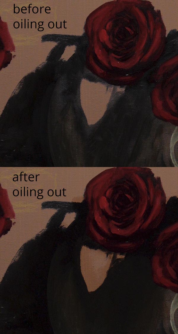
The first question to ask about your work is, "are the values in my shadows correct?" Go and check for yourself: look at any painting you have completed, and check your shadows and compare them to your source.

If you are working from a photograph, then this is an easy check to make. Take the same color that you used to paint your shadow and paint a stroke of it right onto your source photo (you can do the same thing with a color checker if you are painting from life). Is your paint brighter or darker than the shadow color in the source photo? One of the most common mistakes is to paint the value in the shadows wrong. Typically the shadows are far too light and lack the depth and richness of the actual shadows in your subject.

The next question to ask about your work is, "am I exaggerating what I see?" What I mean is, when you paint a reflection on an object, do you make it brighter? When you paint a line, do you make it more visible? If you see a pattern do you paint it stronger? The tendency is to over-define, to paint every edge stronger, to make every line more visible, to over-paint the detail and make it stand out.

"Flowers and Fruit" by Henri Fantin-Latour
click to enlarge

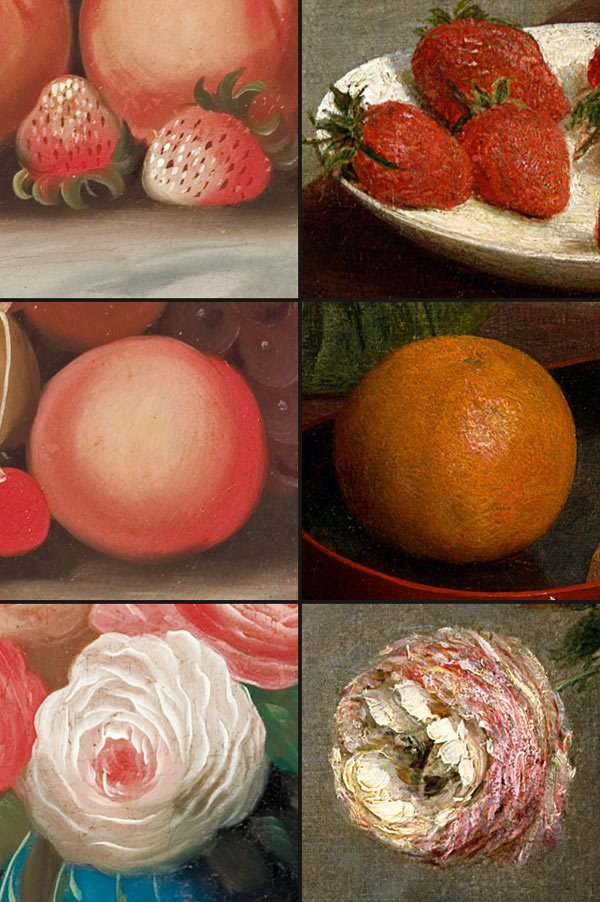
Let's compare the still life above by Henri Fantin-Latour to the one below by William Buelow Gould which I think represents poor realism. Note how the shadows in Fantin-Latour's fruit differ from Gould's. Gould' s are much lighter and lack the richness of Fantin-Latour's shadows.

"Still life with fruit and flowers" by William Buelow Gould
click to enlarge

Also notice how Gould over-defines everything. His lines are sharp, the detail is distinct and all the reflections stand out. There is no subtlety at all. In Fantin-Latour's still life on the other hand, the detail disappears as you look closer — it is very subtle, barely visible at all up close.

comparison of still lifes by W.B. Gould and Henri Fantin-Latour

So it does not matter how messy you paint, it does not matter if your strokes are "ugly", it does not matter if your detail is inaccurate. But what does matter, is that your shadows are the right value and that you are not over-defining what you see.
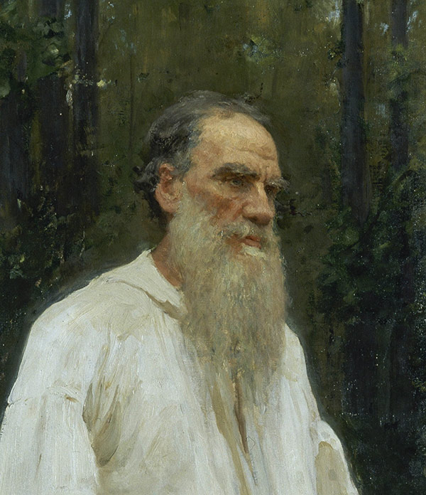
— Mark Carder
my free videos: drawmixpaint.com

Have questions or comments? Click here to discuss this post.

Wednesday, May 7, 2014

Artist or Artisan…
How Do You See Yourself?

ar·ti·san | ˈärtizən

      noun
      a worker in a skilled trade,
     especially one that involves making things by hand.

      synonyms: craftsman, craftswoman, craftsperson
Many years ago when I first started painting I had a view of myself as a naturally gifted artist. It was all pretending, but I wanted to be like Rembrandt or George Inness. I saw them as geniuses and believed all their talent was natural.

George Inness in his studio [1890]

Over the next couple of years as I began to paint more and more this view of myself as a naturally gifted artist began to sink in. People around me told me my work was great and soon I started to believe it.

I did not realize it at the time, but the quality of my work was no longer improving. In fact it was getting worse. I was painting one portrait after another unaware of what was happening.

Then by chance I walked into the Birmingham Museum of Art and saw this painting:

Lady Helen Vincent, Viscountess d'Abernon
click to enlarge

I had been so busy painting portraits, thinking I had it all figured out, that I never really stopped to look at anything else. But standing in front of this masterpiece by Sargent, in an instant it changed my perspective on my own work. I realized I had been fooling myself, my work was nothing like this! It was then that my work really began to improve.

What that Sargent painting did was made me rethink how to paint. I wanted to paint like Sargent, but how did he do it? I no longer believed I could rely on my "natural ability" — that clearly was not working. I decided to relearn how to paint, learn how to solve the problems, learn how to paint well, truly understand my craft. I started seeing myself as an artisan, or a craftsman instead of as a "natural born artist". And for me personally it has made a huge difference.

UPDATE: Someone posted something in the comments that's too good to leave out… here's a great quote by Vincent van Gogh:
I am an artist… it’s self-evident that what that word implies is looking for something all the time without ever finding it in full. It is the opposite of saying, “I know all about it. I’ve already found it.” As far as I’m concerned, the word means, “I am hunting for it, I am deeply involved.”
— Mark Carder
my free videos: drawmixpaint.com

Have questions or comments? Click here to discuss this post.

Sunday, May 4, 2014

Painting from Out-of-Focus Photos

Whenever you paint from photographs, it is always best to work from photographs that are in focus. Even if your subject is in focus, the background around the subject should also be in focus. Sometimes it requires taking multiple shots of the same thing, with different things in focus for each shot.

Let me explain. The human eye never perceives any part of the world as "out of focus". Look around you and the instant you direct your eyes at something, it appears in focus. Try forcing yourself to see out of focus, or take off your glasses if you wear them. Notice how what you see is very different than an out-of-focus photograph.

This may be one of the reasons that before the age of photography, artists never painted the soft blurry effect you see in all out-of-focus photographs. Photographers often will intentionally leave the background behind the subject out of focus. A complicated or busy background can distract from your subject. But an artist has another option.

Take a look at the painting below by Ilya Repin. Notice how the artist have left the background unpolished, or even "unfinished". The subjects face has been given more attention than the background and the background has been left "rough".

crop of "Leo Tolstoy Barefoot" by Ilya Rebin

Now a look at the photograph below and notice how different the soft out-of-focus areas look when compared to the "roughed in" areas of the paintings above.

example of photo with background out of focus

So whenever you are taking photographs that you will use as a source to paint from, unless everything is in focus already, take multiple shots, refocusing as needed for the background. That way when you paint in the background you can work from an in-focus photograph.

— Mark Carder
my free videos: drawmixpaint.com

Have questions or comments? Click here to discuss this post.

Thursday, May 1, 2014

Color is Relative

Welcome to the Draw Mix Paint blog! This is my first post.

I will be posting all kinds of things here that I think will be of interest to artists. Let me start with a comment on color perception. I've always liked this quote by Eugène Delacroix:
“I can paint you the skin of Venus with mud,
provided you let me surround it as I will.”
Our brains always see color in context. If, for instance, you look at a spot of color in isolation — say as a spot on a piece of white paper — it will look completely different than it will surrounded by the other colors in your painting.

You may like a particular color on your palette, but stroke it onto your painting and how it looks to your eye will change dramatically.  Or you may think a color on your palette looks like gray mud, but in its correct place in your painting it may look like the white of someone's eye.

Take a look at this painting by Solomon J. Solomon:

crop of "Portrait of Henrietta Lowy Solomon, the Artist's Sister" by Solomon J. Solomon
click to enlarge

In the image below I have taken the color he used to paint the white of the eye and placed it in isolation surrounded by white and then black. As you can see, the very same color looks very different in each context, even though it is exactly the same color.

the white of the eye isolated in white and then in black

My advice for teaching yourself to see color is simply to use a color checker. After painting a few paintings with a color checker you will begin to see through the color illusions. And after using a color checker for several paintings, you will find yourself needing to use the color checker less and less. Here is a video demonstrating the color checker: youtu.be/NeyYXMl934g

— Mark Carder
my free videos: drawmixpaint.com

Have questions or comments? Click here to discuss this post.